In March, a visual data journalist at The Economist published an article on Medium about their "errors in data visualisation."
In the article, the journalist fixed a number of visualisations the new organisation has published over the years.
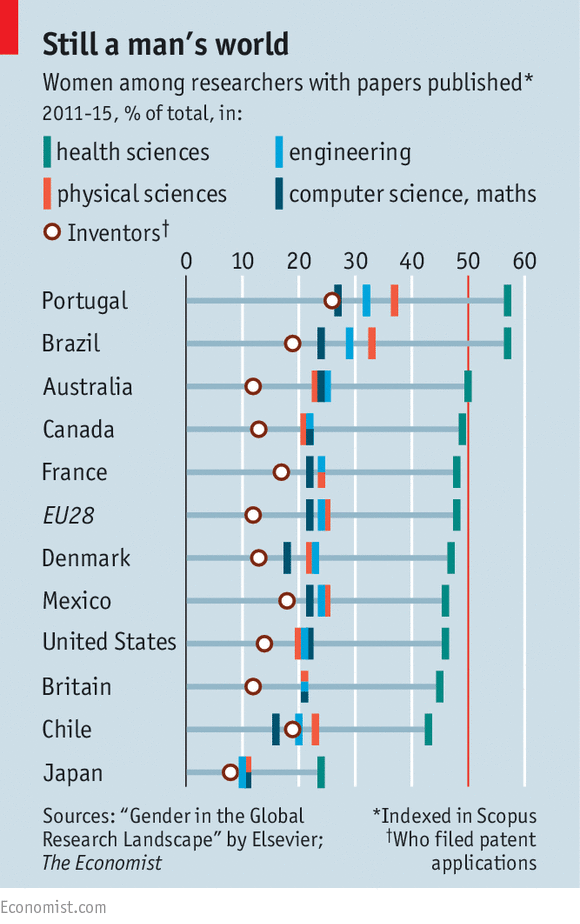
The only one she did not fix was a graph which she described to be containing too much information.
Instead of showing all the data in a static graph, it might be a good idea to present the data with interactive bar charts like the following:
A drop-down menu can also be created for readers to navigate graphs featuring data of different fields.
The following bar chart is created to show an easy but effective way to show the percentage of women inventores who filed patent applications from 2011 to 16.